
EmbeddingViewMosaic
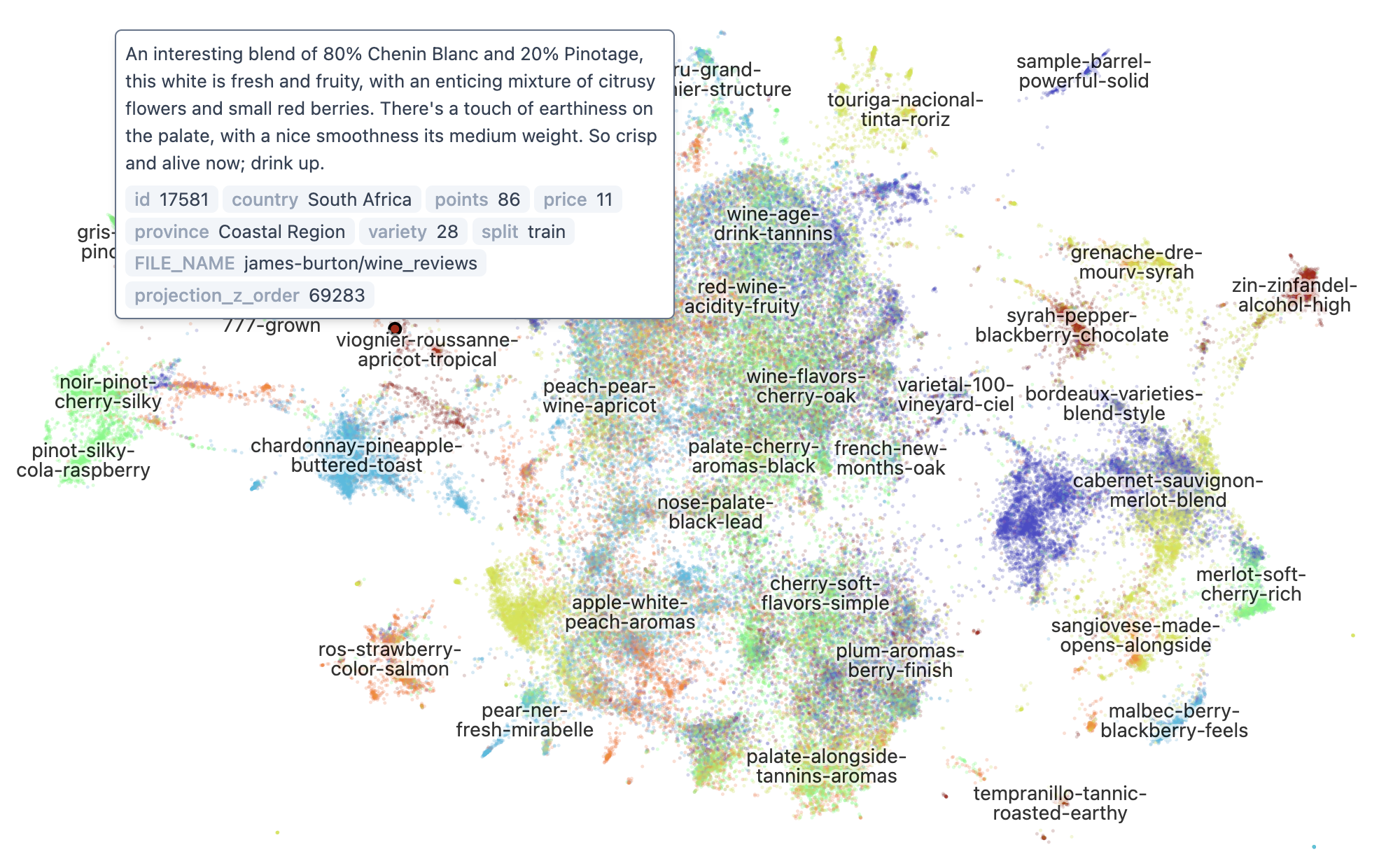
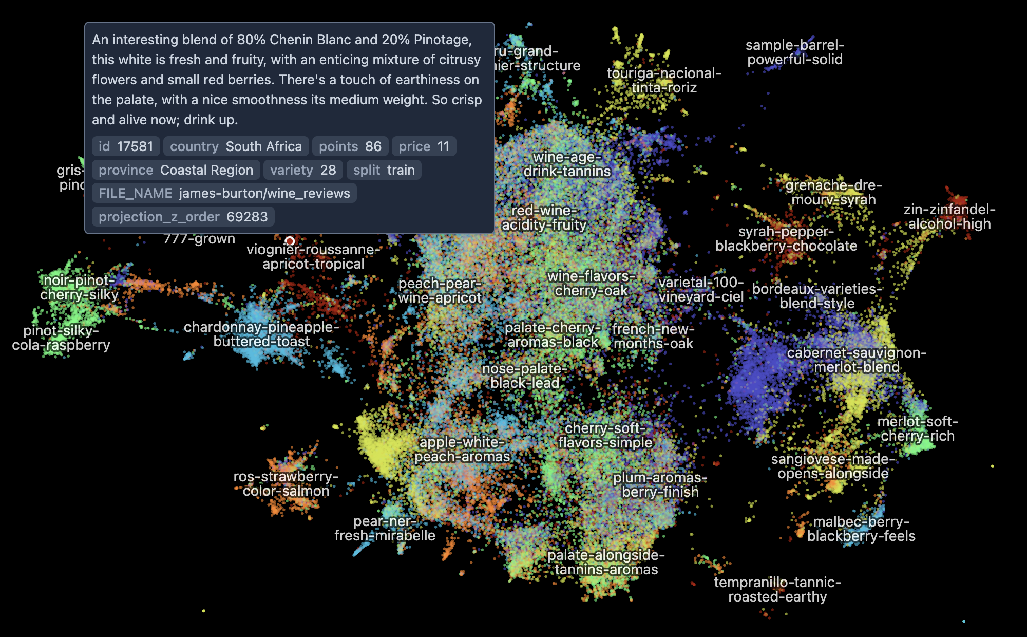
The embedding-atlas package contains a component for displaying up to a few million points from an embedding with x and y coordinates. The component connects to a Mosaic coordinator and can display data for specified table and x, y coordinate columns.
We also provide React and Svelte wrappers for the component to easily include it in your own application.
npm install embedding-atlasTo use the React wrapper:
import { EmbeddingViewMosaic } from "embedding-atlas/react";

<EmbeddingViewMosaic
  table="data_table"
  x="x_column"
  y="y_column"
  category="category_column"
  text="text_column"
  identifier="identifier_column"
  filter={brush}
  ...
/>
To use the Svelte wrapper:
import { EmbeddingViewMosaic } from "embedding-atlas/svelte";

<EmbeddingViewMosaic
  table="data_table"
  x="x_column"
  y="y_column"
  category="category_column"
  text="text_column"
  identifier="identifier_column"
  filter={brush}
  ...
/>
If your application does not use React or Svelte, you may directly construct the component:
import { EmbeddingViewMosaic } from "embedding-atlas";

let target = document.getElementById("container");
let props = {
  table: "data_table",
  x: "x_column",
  y: "y_column",
  category: "category_column",
  text: "text_column",
  identifier: "identifier_column",
  filter: brush,
  onTooltip: (value) => {
    // ...
  },
};

// Create and mount the component
let component = new EmbeddingViewMosaic(target, props);

// Update with new props
component.update(newProps);

// Destroy the component
component.destroy();
Properties
The view can be configured with the following properties (props):
coordinator Coordinator
The Mosaic coordinator. If not specified, the default coordinator from Mosaic's coordinator() method will be used.
table string
Required. The data table name.
x string
Required. The x column name.
y string
Required. The y column name.
bounds { x: [ number, number ]; y: [ number, number ]; } | null
Axis-aligned bounds for (x, y) in data units. If provided, the scatter query packs coordinates as u32 on the wire and unpacks to f32 on the client GPU — quantum is ~range / (2³² − 1), well below sub-pixel at any zoom (1.5 cm at the eubucco 40°-lon span). Leave unset to stream f32 directly.
precomputed { x_u16: string; y_u16: string; y_is_mercator?: boolean; } | null
Names of pre-computed u32-quantised x/y columns on the source table. When set, the scatter query becomes a pure SELECT x_u16, y_u16 scan — no per-row arithmetic, no bounds clamps. The loader fills these at CTAS time once the bounds are known.
Field names x_u16 / y_u16 are kept as opaque identifiers for backwards compatibility with stored configs — the actual wire type is now u32 (a Uint32Array arrives over the wire), and the renderer dispatches a u32→f32 unpack pass on the GPU.
Requires bounds to be set as well (the same linear map is used to unpack u32 → f32 on the client side).
viewportHint { centerX: number; centerY: number; rangeX: number; rangeY: number; rowCount?: number; skipDeferredRefine?: boolean; } | null
Optional viewport defaults derived from the dataset bounds. When present, the view skips the cold-load APPROX_QUANTILE+STDDEV round trip (≈5 s on 75 M-row GIS datasets) and centers the camera using the bbox midpoint with a scaler sized to fit the bbox. The hint is never used for wire packing — pass it independently of bounds so the f32 wire path stays in effect and quantization stays off.
category string | null
The name of the category column. The categories should be represented as integers starting from 0. If you have categories represented as strings, you should first convert them to 0-indexed integers.
text string | null
The name of the text column. If specified, the default tooltip shows the text content. The text content is also used to generate labels automatically.
image string | null
The name of the image column. If specified along with importance, cluster labels will display the highest-importance image per region.
importance string | null
The name of the importance score column (e.g., PageRank, centrality). Used together with image to select representative images for cluster labels.
identifier string | null
The name of the identifier (aka., id) column. If specified, the selection object will contain an identifier property that you can use to identify the point.
additionalFields Record<string, DataField> | null
Additional fields for the tooltip data element. Each field can be specified as a column name or a SQL expression.
categoryColors string[] | null
The colors for the categories. Category i will use the i-th color from this list. If not specified, default colors will be used.
filter Selection | null
A Mosaic Selection object to filter the contents of this view.
labels Label[] | null
Labels to display on the embedding view. Each label must have x, y, and text properties, and optionally level and priority.
width number | null
The width of the view.
height number | null
The height of the view.
pixelRatio number | null
The pixel ratio of the view.
theme ThemeConfig | null
Configure the theme of the view.
config EmbeddingViewConfig | null
Configure the embedding view.
viewportState ViewportState | null
The viewport state. You may use this to share viewport state across multiple views. If undefined or set to null, the view will use a default viewport state. To listen to viewport state change, use onViewportState.
tooltip Selection | DataPoint | DataPointID | null
The current tooltip. The tooltip is an object with the following fields: x, y, category, text, identifier.
You may pass the identifier for the data point (DataPointID), or a DataPoint object, or a Mosaic Selection. If an id or a DataPoint object is specified, you will need to use onTooltip to listen to tooltip changes; if a Mosaic Selection is used, the selection will be updated when tooltip is triggered.
selection Selection | DataPoint[] | DataPointID[] | null
The current single or multiple point selection.
You may pass an array of DataPointID or DataPoint objects, or a Mosaic Selection. If DataPointID[] or DataPoint[] is specified, you will need to use onSelection to listen to selection changes; if a Mosaic Selection is used, the selection will be updated with the appropriate predicates.
rangeSelection Selection | null
A Mosaic Selection object to capture the component's range selection.
rangeSelectionValue Rectangle | Point[] | null
The rectangle or polygon that drives the range selection. Setting this changes the current range selection and also affects the selection passed in rangeSelection. Use onRangeSelection to listen for changes to this rectangle.
onViewportState ((value: ViewportState) => void) | null
A callback for when viewportState changes.
onTooltip ((value: DataPoint | null) => void) | null
A callback for when tooltip changes.
onSelection ((value: DataPoint[] | null) => void) | null
A callback for when selection changes.
onRangeSelection ((value: Rectangle | Point[] | null) => void) | null
A callback for when rangeSelection changes.
customTooltip CustomComponent<HTMLDivElement, { tooltip: DataPoint; }> | null
A custom renderer to draw the tooltip content.
customOverlay CustomComponent<HTMLDivElement, { proxy: OverlayProxy; }> | null
A custom renderer to draw overlay on top of the embedding view.
cache Cache | null
A cache for intermediate results.
Config
You can pass in an object with the following properties to the config property of the embedding view:
colorScheme "light" | "dark" | null
Color scheme.
mode "points" | "density" | null
View mode.
minimumDensity number | null
Minimum average density for density contours to show up. The density is measured as number of points per square points (aka., px in CSS units).
pointSize number | null
Override the automatically calculated point size. If not specified, point size is calculated based on density.
autoLabelEnabled boolean | null
Generate labels automatically. By default labels are generated automatically if the labels prop is not specified, and a text column is specified in the Mosaic view, or a queryClusterLabels callback is specified in the non-Mosaic view. Set this to false to disable automatic labels.
autoLabelDensityThreshold number | null
The density threshold to filter the clusters before generating automatic labels. The value is relative to the max density.
autoLabelStopWords string[] | null
The stop words for automatic label generation. By default use NLTK stop words.
downsampleMaxPoints number | null
Approximate maximum number of points to render when downsampling is active. Points are sampled with bias toward sparse regions (fewer points kept in dense areas). The sampling probability is given by this formula: P(i) = (downsampleMaxPoints / numPointsInViewport) * (2 / (1 + density(p_i) / maxDensity * downsampleDensityWeight)) Default: 4,000,000. Set to null or Infinity to disable downsampling.
downsampleDensityWeight number | null
Density weight for downsampling (0-10). Higher values mean more aggressive culling in dense areas. Default: 5
downsampleMaxPointsInteractive number | null
Cap on points to render while the user is actively dragging or wheeling. The configured downsampleMaxPoints still applies once the gesture settles. Setting this drops frame time during pan on very large datasets (75M-row Overture parquet goes from ~9 fps at 4M cap to ~25 fps at 200K during the gesture, then snaps to full quality on release). Default: 200,000. Set to null to disable adaptive capping.
isGis boolean | null
Enable GIS mode (Mercator projection for the Y axis).
mapStyle string | null
MapLibre style URL.
Theme
You can pass in an object with the following properties to the theme property of the embedding view. You can also provide these options as light and/or dark properties, which will control the appearance of the view depending on its colorScheme. For example:
{
  light: {
    clusterLabelColor: "black";
  }
  dark: {
    clusterLabelColor: "white";
  }
}
fontFamily string
The font family for texts.
clusterLabelColor string
Color for cluster labels.
clusterLabelOutlineColor string
Color for cluster labels' outline.
clusterLabelOpacity number
Opacity for cluster labels.
statusBar boolean
Whether to show the status bar at the bottom.
statusBarTextColor string
Color for status bar text.
statusBarBackgroundColor string
Color for status bar background.
brandingLink { text: string; href: string; } | null
Branding link.
Custom Tooltip
You may use the customTooltip property to change how tooltips are displayed.
First create a class for the custom tooltip component:
class CustomTooltip {
  constructor(target, props) {
    // Create the tooltip component and mount it to the target element.
    // props will contain a `tooltip` field, plus any custom prop you specified.
  }
  update(props) {
    // Update the component with new props.
  }
  destroy() {
    // Destroy the component.
  }
}
Then specify the customTooltip property to the component:
<EmbeddingViewMosaic
  ...
  customTooltip={{
    class: CustomTooltip,
    props: { customProp: 10 } // Pass additional props to the tooltip component.
  }}
/>
Custom Overlay
You may use the customOverlay property to add an overlay to the embedding view.
First create a class for the custom overlay:
class CustomOverlay {
  constructor(target, props) {
    // Create the tooltip component and mount it to the target element.
    // props will contain a `proxy` field, plus any custom prop you specified.
    // You can use proxy.location(x, y) to get the pixel location of a data point at (x, y).
  }
  update(props) {
    // Update the component with new props.
  }
  destroy() {
    // Destroy the component.
  }
}
Then specify the customOverlay property to the component:
<EmbeddingViewMosaic
  ...
  customOverlay={{
    class: CustomOverlay,
    props: { customProp: 10 } // Pass additional props to the overlay component.
  }}
/>